Showing posts with label colour 101. Show all posts

Sunday, 29 January 2012

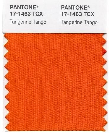
2012 COLOUR OF THE YEAR - TANGERINE TANGO

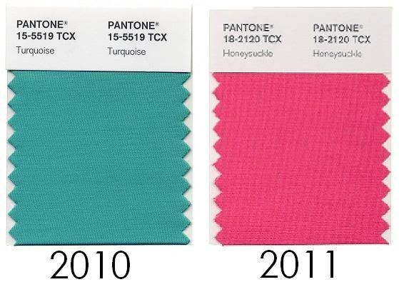
PhotobucketEarlier this month Pantone Colour Institute did their official announcementof the colour of the year for 2012.  The last two years I have kept you up to date on Pantone colour choice of the year for 2010 Turquoiseand 2011's Honeysuckle"and this year will be no different! I find it so exciting to see which colour will reign as the "it" colour of the year because it literally becomes incorporated into all areas of design whether that be from home decor, fashion and makeup trends, to architectural choices. Already Tangerine Tango has started popping up all over the place; if you've visited the malls or taken a look magazines you'll notice the usage of this colour becoming more and more predominant as we look forward to forgetting winter and welcoming spring. 

Say Goodbye to Honeysuckle the colour that encouraged us to face our everyday trouble with verge and vigor and say Hello to Tangerine Tango which will take Honeysuckle's message a step further by giving us the "energy charge" we need to actually make change happen.   

Photobucket
TANGERINE TANGO
Here's what the executive director at Pantone Colour Institue had to say about 2012 colour of the year:


 “Sophisticated but at the same time dramatic and seductive, Tangerine Tango is an orange with a lot of depth to it {...} reminiscent of the radiant shadings of a sunset, Tangerine Tango marries the vivaciousness and adrenaline rush of red with the friendliness and warmth of yellow, to form a high-visibility, magnetic hue that emanates heat and energy.” 


Thinking of adding 'Tangerine Tango' into your home decor? I've read about people who paint their walls or get the "colour of the year" sofa to keep up with home decor trends. In my opinion that's a bit much simply adding it as an accent colour will do the trick!  Tangerine pairs well with neutral colour such as grey, brown, cream and white.  It also looks great with bolder colour such as ice blue, greens like olive and army, yellows, navy blue, and other colours in the orange family.
Photobucket
Decorating with Tangerine Tango
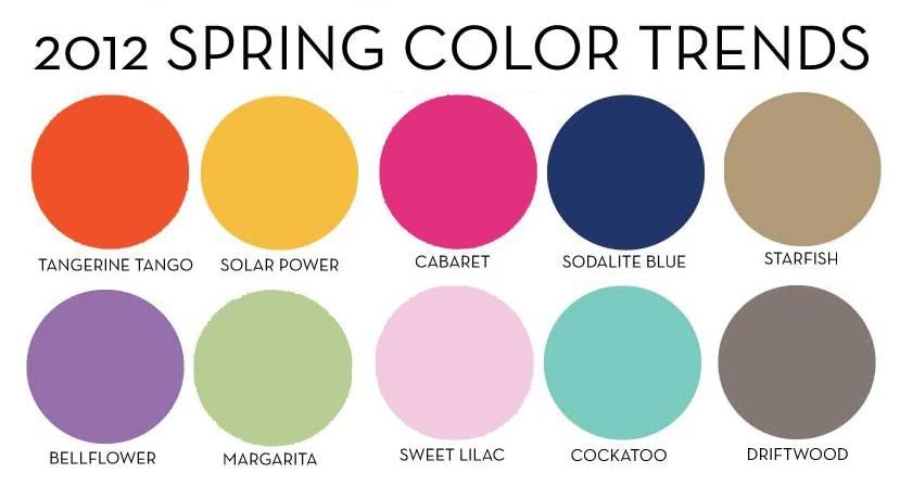
These are the other colours chosen for Spring 2012.  A lot of these colours pair well with 'Tangerine Tango' as combined accent pieces. You can use them in your wardrobe for fashion forward colour blocking outfits as well. 

Photobucket
With today being the first day of February, is it too early to start counting down the days until Spring?

Will you be adding Tangerine Tango to your home decor this year? @ us on twitter @modsensibility and let us know!

Thursday, 24 November 2011

THE COLOUR 101: CHOOSING THE RIGHT COLOUR FOR EVERY AREA OF THE HOME

Have you recently decided to paint your home, or redecorate a room? You've started visiting the stores excited to choose the perfect colour only to realize that the possibilities were endless? Frustrated at the idea of what goes where: "Do I want the sky blue or bluebell, lavender or amethyst maybe violet." Who knew there were this many shades of ONE particular colour; even white comes in cream white, off white, opaque and the list goes on. 

Colours become easier to choose when you learn that specific colours and shades affect your mood in a particular room, and that there are do's and don'ts in decorating your home depending on the room and its function. A good tip is to bring home paint samples and do paint 'tests' in different areas of the home; this will help you see the colour in its true shade, and get a better feel for how it'd look in the room. A good tip is to look at home décor magazines, blogs or Google pictures of themes and styles you like so you have a better idea of how you'd like to decorate.

LIVING ROOM:
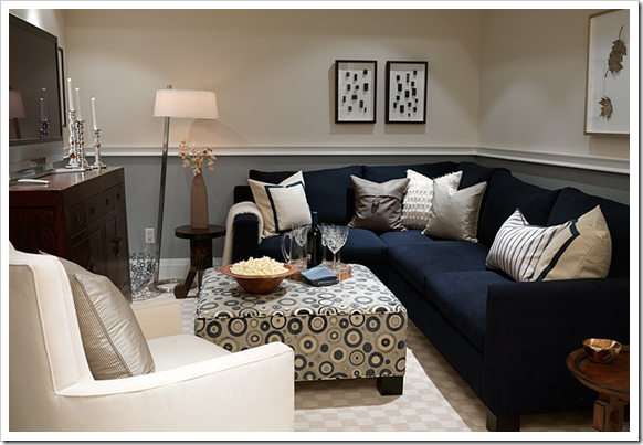
PhotobucketThe living room is the place where you spend most of your time.  It's the place where you relax after a long day in front of the television, spend time with your family and entertain your friends and extended family when they come over. This room is a multifunctional room and gets the most action so your colour scheme is more varied. You don't have to stick to any particular rules in this room of the house.

- Use neutrals like beige, creams, grays, and lighter tones. Pair them with bold accessories to add colour. Changing your accessory colour is easier than repainting; to change your decor simply change your accessory colours.
-Use red to make your wall stand out.  Pair it with brown to tone it down.
-If you have dark colours on the wall like a navy blue, pair it with lighter tones such as white for contrast. 
- Don't be afraid of colour, choose colours that pair together well. 
-Follow the 60:30:10 Rules -- 60% of one colour, 30% of another colour and 10% of accents.

BATHROOM:
Photobucket
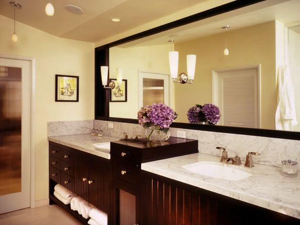
The bathroom is the place where most of your grooming and daily upkeep takes place. You want your bathroom to be a place that is soothing and relaxing, feels large and roomy and provide lots of light. People want their bathroom to feel like an at home spa (at least I do) so why not achieve that 'feeling' easily with colour.

DO:
-Use blue as a top choice in the bathroom. Choose blue in lighter hues, this will automatically create that calming and relaxing feeling. 
-Using peach in the bathroom is a bonus for those who love to do all their grooming in this room.  Peach reflects well on the skin and is important if you'll be doing your makeup there, or if you're a man shaving on a regular basis. Lavender is also a really good colour in the bathroom. 
-White: This one is a no brainer. White is clean and simple. It is fresh and adaptable, if you think white might be a little too bland on its own dress it up with accents such as towels, and vases, maybe some flowers. 
-Use your favourite colour in the bathroom. When you feel good your confidence will be better. 
-Maximize the space underneath your sink. Buy a standing shelf or decorative boxes to make storing products and finding things a breeze.

DON’T:
- Use a colour that isn't flattering to you or your body type, or skin tone. This will reflect badly in a room used for grooming.
-Use too many colours in the bathroom.  Since the room is so small it will feel cramped and overcrowded with multiple use of colour.

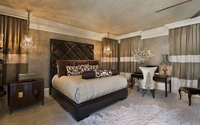
BEDROOM:
PhotobucketThe bedroom is the place used for ultimate relaxation.  It is where you sleep, relax and watch TV under the blankets after a long day. Many suggest not using your bed for anything other than sleep, even though many of us don't listen to this rule it goes to show the bedroom is a place to relax. The colour you use in there should be ones that are used to reflect such states of relaxation.

DO:
-Use cool colours such a blue, lavender, greens, beige in the bedroom. Be careful when choosing these colours because depending on the shade or undertone it could have the opposite effect.
-Pair two 'cool' colours together to create a colour scheme that use relaxing colors in relaxing rooms.
-Make everything in your bedroom beautiful, if everything around you is beautiful you will also feel beautiful in there.  
-If space allows, create a sitting area in your bedroom. If you’re having close friends over and you’re spending time in the bedroom they have a place to sit other than your bed.

DON’T
-Choose loud colours such as red, hot pink, royal blue, or bright sun yellow. This will disturb the flow of the room and instead of feeling calm and relaxed you'll feel fidgeting, angry or irritated. 
- Put an office in your room.  It will constantly remind you of work to be done, and take away from relaxation and sleep.

Photobucket
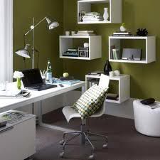
HOME OFFICE:
The office is the place in the home that is used to concentrate, stay organized, and get work done. This is the place where you WORK, nothing else should be done in this room because you want to associate this room with work and concentration.  This is the place to be completely focused so that you can complete the tasks at hand with ease and increase productivity. 

DO:
-Use colours such as green and yellow which inspire concentration in an office. Neutral colors like lemons, pastel blues and creams are also good color choices.
--Go with a bright colour over a neutral if you work in advertising, or a job that require creativity.  Bright colours are said to stimulate your mind and appeal to your creative mind.
-Combine a professional space, with the luxury of comfort.  Use a comfortable chair and a good sturdy table.
-Make it inviting.  This is the place where you will have meetings with clients, or other business people. Having adequate seating space maybe a bench or love seat and two chairs would make it look like you're ready for business. 
-Try to get as much natural lighting in the room as possible, this tip holds true for every room.

DON'T:
- Mix your home life with your work space. Try to keep them as separate as possible.  Treat it as if your home office is your office away from home.  

Example: Don't eat, or watch TV in there do that in your respective room. Matter of fact do not even attempt to put a TV anywhere near your home office.
- Clutter your office. Buy bins, and boxes that go with your colour scheme and label them so you know the contents of the box. Not only will this help keep you organized but it will add a decorative touch to the room as well.
- Use distracting colours. Colours such as red will make you feel irritable in a home office. 
- Put your office in a high traffic area of the house.  Try to keep away from noise and any outside distraction.  This will help you keep more concentrated on what you have to do.  If you have a family, work time should be work time. You won't be tempted to check up on the household with every noise you hear.

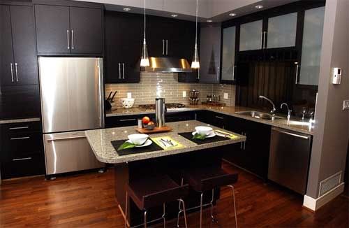
KITCHEN: 
The kitchen is the most important area of the house. It is the place used to cook meals and is a meeting place for families. The kitchen is the heart of the home. Sterilization and cleanliness are at the utmost importance here.

PhotobucketDO:
-Use red in the kitchen to build an appetite. If you don't want to go all out using red, pair it with a neutral colour for the same effect. 
- Use white if you're someone who likes to try out different meals and recipes in the kitchen. It is said to help with creativity.
-Keep everything neat and tidy and in its place. Use fun storage ideas that keep everything in sight but not in the way. 
-Add an element of comfort to the kitchen, whatever that may be for you. This is the place where your family will gather to talk and eat, and should be inviting to guests as well. 

DON’T:
-Use carpet in the kitchen or hard to clean flooring.  The kitchen floor is always getting dirty with spills and food and dirt you want to be able to easily mop or sweep it up. Hard to clean floors will eventually look grimy and unpleasing to the eye; even after a good cleanup.
-Hang anything over the stove; this is a cause for safety concerns. 
- Make it harder for yourself to stay organized in the kitchen.  Purchase shelves, racks, and bins for under the cabinets to keep your pots, pans and storage containers organized and easy to reach.
-Avoid Lighting, natural or otherwise.  Light brightens up the whole space and automatically makes it feel warm and inviting.
Tuesday, 11 October 2011

COLOUR 101: FALL COLOUR TRENDS 2011


Photobucket"texture, contrast and color for fall 2011 – pairing menswear with feminine twists, warm prints with cool metals, incorporating both old and new influences, and creating an intriguing balance between colors."

Fall officially started on September 22nd that first week of fall seemed like Mother Nature was going to skip Fall and head straight to Winter. Thank goodness October is beaming with sunlight, hot weather, and cool breeze. Fall is one of my favourite seasons I call it "Perfect Sweater Weather." You know fall is here when it starts getting darker earlier, the days are warm but nights are chilly and you start thinking about Thanksgiving dinner and Trick or Treating on Halloween. My favourite part of all is the beauty of watching nature change.  The green leaves turning yellow and orange really let me know fall is here.

This is what Pantone had to say about the Fall colours:

“Designers take a painterly approach to fall 2011 by artfully combining bright colors with staple neutrals, reminiscent of how an artist would construct a stunning work of art,” said Leatrice Eiseman, executive director of the Pantone Color Institute®. “Much like a painter's masterpiece, there is a certain romance to this season's palette.”

With every new seasons that comes new colour trends arrive and you quickly see them popping up in all types industries, from retail to the runway, in home decor, and even architecture. Pantone has the authorize say in reporting what colours will be in style for the season.  

To read about each individual colour Click Here

WILL YOU BE INCORPORATING THESE FALL COLOUR TRENDS INTO YOUR HOME DECOR, OR DAY TO DAY LOOKS?

Thursday, 21 July 2011

COLOUR 101: WHAT DOES YOUR SOFA COLOUR SAY ABOUT YOU?

Colour plays a huge factor on how we visually express ourselves. They also  represent how we feel from moment to moment and can change our moods depending on the colours we are around.  People who study colour have found that different colours are associated with certain characteristic unique to that specific colour. There is a science behind colour that can even be used as insight into our personalities. Have you ever wondered why you feel relaxed in a green room? Or why the fast and sporty Ferrari is associated with red (hint: it wasn't an accident) colour can even affect the mood in your home.

What does the colour you choose for your sofa say about your personality? After you've chosen the style you want, what colour were you drawn too? Are you an adaptable Beige? A powerful Black ? Or a fiery exciting Red? I decided to weigh in on colour meanings and what they say about you.


Photobucket 
Black is a colour of tradition, it is timeless and will always be in style.  Although traditional it is also a bold and dominating colour that speaks for itself. Black comes with an air of power and sophistication. Those who gravitate towards black are said to be confident, and self-aware and enjoy the finer elegant things in life.

Note: Overuse of this colour can easily have the opposite effect of power however, and leave you feeling empty due to its lack of colour. 

Photobucket  
Beige is a quiet, relaxing shade close in colour to white but said to be warmer due to its mixture of brown.  Beige is a neutral, ever changing colour that works well with any colour theme.  On it's own it is viewed as plain or 'boring' but it's a perfect complimentary colour,taking on the characteristics of any colour it is paired with.  The ever changing chameleon feature of this colour is perfect for people who crave change, and excitement.  If you're the type who likes to switch your accent pieces on a wim then beige is the colour for you because it will change as you change.

 Photobucket  
Grey also known as the "new beige" has gained popularity in the last year as the new "it" colour.  Grey like beige is a perfect neutral that blends well with any colour, the difference between them is grey is not trying to fit in; it stands well on its own.  Those who choose grey are known to be conservative, knowledge people who know their worth but don't feel the need to brag or boast about it. They'd rather be in the shadows than stand out.  There is more than meets the eye with "grey people" because it comes in multiple of shades (500 distinguishable shades to the human eye).

Photobucket 
Red is a stimulating, bold, exciting colour. It is also the colour of passion, love, sex and desire.  It is a colour called to action, and demands attention in any space or room it is used in. Although it can be paired with different colours such as green(Christmas), yellows,and purples red does not like to share the spotlight and looks best paired with neutrals such as grey. Those who gravitate towards this colour are known to be attention seekers and love the thrill of a new adventure. They are confident people who enjoy feeling and looking beautiful.  This is a great colour choice if you're looking to add some excitement to a room because of its stimulating nature.


Photobucket 
Brown is the most chosen sofa colour for home decor because of its practicality. Why brown is such a fan favourite is because it is a colour we are so used to seeing in nature, making us feel closer to the world around us.  It offers stability and matches well with any color theme.  This is a great sofa choice for those who like to entertain because it creates a comfortable and inviting atmosphere in the home.  This will help when inviting guest over because they will automatically feel closer to you; friendships will deepen because you will be seen as a warm, approachable person.

 Photobucket  
Blue has the undeniable ability to make everything around seem cool, laid back and peaceful. It is a widely popular colour chosen not just in home decor, but in general as well.  Having a blue sofa in your home shows that you are an easily liked, friendly, trustworthy and loyal person; all the qualities of a great friend. They are also known to be traditional, non-risky people who like to stick to the status quo. 

This colour is a perfect choice for married couples because blue is not a gender specific colour so there will be no fuss when deciding on a colour choice. 


Here's a fun colour personality quiz(we all took it here at the store it is VERY accurate!) : colour quiz

WHAT DOES YOUR SOFA COLOUR SAY ABOUT YOU? 
TELL US ON TWITTER @MODSENSIBILITY


*colour research was done using Sensational Colour

Saturday, 19 March 2011

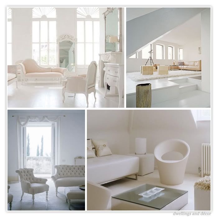
COLOUR 101: ALL WHITE EVERYTHING

101 Ideas: Colour by Vinny Lee says as a rule "...If you're using white, whether on hard or soft surfaces, you should make sure you keep it well maintained.  If a white surface becomes grubby or stained, it is instantly noticeable and will make the whole room look shabby.  Choose machine-washable white fabrics wherever possible so that you can easily keep them pristine and wipe marks off woodwork as soon as you see them."

How beautiful is an all white room?  Unless you live on your own completely free of mess, or in a mansion where the rooms are not lived in but used for pure admiration; having a white room is simply unrealistic. The upkeep and maintenance is simply not worth having such a room. Also, in order to prevent the all white room from the awful hospital feel, natural light must be in abundance to highlight all your white pieces. I love the way an all white room looks fresh and feels airy like a cool summer’s day. I always picture myself living in an all white home; I'm not talking about all the different shades of white either but that crisp fresh white with no undertones.  Then I think about dust, everyday dirt, accidents and spills and how upset I'd be when my crisp whites, look more like dingy greys. That's usually the thought that makes me quickly change my mind and think ummm, better stick to some colours!

I thought I'd let us enjoy some pictures and pretend if only for a moment that we live in such beautiful 'white' homes: 
Photobucket
Photobucket 
Photobucket

Tuesday, 8 March 2011

COLOUR 101: IS GREY THE "NEW" BEIGE ?


Photobucket
“If I see everything in gray, and in gray all the colors which I experience and which I would like to reproduce, then why should I use any other color? I've tried doing so, for it was never my intention to paint only with gray. But in the course of my work I have eliminated one color after another, and what has remained is gray, gray, gray!” -- Alberto Giacomettii


Is grey really the new beige? I had to find out.Photobucket I knew it was becoming an increasingly popular colour in home decor but would it really be replacing beige as the go to neutral? I wasn't too sure. Grey is usually associated with words like dingy, bland, boring, depressing; at least to me it was. These words are now replaced by words like welcoming, inviting, clean, elegant, sophisticated, and refined. I never thought of it as a truly exciting colour, matter of fact I never thought it was a colour that had much versatility to it at all. If you had told me a year ago that I would be writing about grey as this fabulous new colour, or that I'd consider owning a grey sofa I'd probably cry with laughter at how ridiculous the thought was.

Go figure! Since I am a huge fan of black and at one point felt strongly about accenting my black sofa with light blue.  That all changed recently, not because I'm a trend follower but simply because in the past couple of months grey has truly inspired me. I love the way it matches with both light and dark shades of colours and looks completely different from room to room depending on what it's matched with. I have become VERY fond of grey and lilac, grey and light green, or a combination of the three. It also matches well with reds, yellows, and blues. It’s a neutral colours so it will match well with any colour scheme you can think of. Due to the versatility of this colour it is even replacing brown as the go to colour for dining room tables, and sofas.

Is grey the new beige? I definitely think so. In my opinion it trumps beige on all fronts because of its ability to be a cool, understated colour or a deep dramatic colour. It coordinates well with any and every space from your living room to the bathroom and with virtually any accent colour to get the result you're looking for. Grey is without a doubt the go to neutral and I think it will stay that way for a long time.


"Gray is the color of intellect, knowledge, and wisdom. It is perceived as long-lasting, classic, and often as sleek or refined. It is a color that is dignified, conservative, and carries authority. Gray is controlled and inconspicuous and is considered a color of compromise, perhaps because it sits between the extremes of black and white. Gray is a perfect neutral, which is why designers often use it as a background color."  - Kate Smith from Sensational Color

Click Hereto read a fascinating description of what the 
colour grey represents.

Let me know what you think. Do you agree that grey is the new beige?

Photobucket